Excel is the very popular application of Microsoft Office suite, but this is very tricky also. And we all know the fact that how complex is it.
However, there are many features in Excel that makes it less complex and easily perform certain tasks. One of the most powerful Excel features is the Pivot Tables.
A Pivot table allows you to extract the impact from a detailed, large data set. This helps you to quickly sum up and categorize many table records into a single report.
With the help of pivot table, it is possible to spot sales trends and examine the underlying data fast, for example: on regions or product, particular years.

The pivot table is very intelligent and very well knows to compare selected expanded quarters or months.
So today in this article I’ll show you how to use Pivot table to analyze trends. But before moving further here I have something for you.
If you want to become more productive in Excel and want to learn Pivot Table the powerful Excel feature, then visit Learn Advance Excel Easily.
Know Learn How to Analyze Trends Using Pivot Tables
1. Create a Pivot Table
Very firstly, you need to create a Pivot table in Excel. Then know how to analyze trends using pivot tables.
Here follow the steps to do so:
-
- In the table click any Cell
- Then, go to “Insert” tab
- After that click “Pivot table” button

- Lastly, click OK
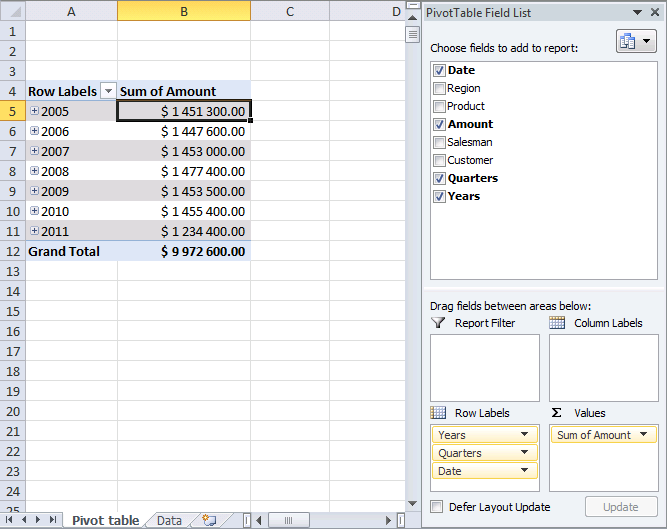
2. Group Data
Your pivot table looks like the below-given diagram.
-
- Then click > hold on Date in Pivot table field list
- And drag > release “Row Labels” area
- Now in the pivot table right click on any date

-
- Click Group

-
- Choose months, quarters and Years > OK

Well, in this way you can group the data, know follow the ways how to analyze data with a Pivot table.
3. Analyze Data (Pivot Table)
- First add “Amount” to the Pivot table.
- Then click > in the pivot table field list hold “Amount“.
- And drag > release over Values area.
Now the entire sales in each year are shortened.

- And click on any + sign to expand the particular year data. Well as you grouped data into years, quarters and months, the next “level” is quarters.

- Again click + sign on a quarter and you can see the months are displayed.

- After that you can collapse and expand the entire fields with one click. Now right click on any data > choose “Expand Entire Field”.
Also Read:
- 8 Easy Excel Filters To Save Time, Money and Get Accurate Data
- 7 Underrated Excel Functions That I Wish Knew Before
- 16 Advanced Excel Skills To Succeed at Office
4. Compare Performance, year to year, quarter to quarter (previous year), month to month (previous year)
Now add the pivot table field “Amount” to the Values as done in step 3 and follow the below given steps.
-
- First click on “Sum of Amount” field > “Values” area
- Then, click “Value Field Settings” > go to “Show Values As” tab

-
- Choose Show values as “Difference From” > choose Years in Base field
- Select (previous) in Base item > OK

- You can see a sharp decline in sales in 2011 > expand 2011

- Note there are no +/- values in the quarters, because one year is expanded. Now compare it with the year 2010 and expand year 2010.

- You can see the sales were good in the first three quarters but the fourth quarter was poor. You can now compare sales to year 2009 and collapse 2010 and expand 2009
- Sales were pretty good in the three first quarters but the fourth quarter was terrible. You can quickly compare sales to year 2009 > collapse 2010 and expand 2009.
- You can see the values in the +/- column are changed! And compare the 2011 quarters to quarters 2009.
5. Product Trends
Here know which products show decline in 4th quarter sales in 2011.
Follow the steps:
-
- First, click “arrow” near “Row Labels”
- Then choose the year 2010 and 2011 only
- Now remove “Sum of Amount” in Values “Field”
- And drag the products from Pivot table field list to Column area.

- You can easily see that “Access points” and “Modems” are having the largest declines in 4th quarter sales in 2011.
6. Region Trends
This is the time to calculate % difference from same quarter last year. Do the entire market have same sales decline.
-
- In the values area first click on “+/-“.
- Then on Value Field Settings > change custom name to “%”

-
- And change Show values as: % Difference From
- Click OK > remove Products from Column Labels area
- Lastly, Add Region to Column Labels area

- You can see the entire markets show a decline in sales.
Well, this is the whole process to use Excel Pivot Table for analyzing trends.
Apart from the there are many other uses of the powerful pivot table.
In our Advance Excel courses, we offer the users to know more about the Pivot Table.
Here you can learn the way to use Pivot Table techniques to become more creativity and do a lot more with your data. Some of them are given below:
- You can use Pivot Tables as the calculation engine behind the management reports.
- Learn the Pivot Tables trick to do more with your data.
- Know to create flexible reports by making use of GETPIVOTDATA() and CUBE formulae
- Slicers and Timelines in Excel 2010 and 2013 – you can make your PivotTables more interactive and advance
- Learn working with Pivot Charts
- By making use of PivotTables and Slicers know how to build interact dashboard.
- Know the calculated fields and calculated items.
Conclusion:
Well, this is all about the Excel Pivot table and how you can use it to analyze trends.
Here I have listed the complete ways of analyzing trends using Pivot Table with the help of example.
Pivot Table is very powerful as well as useful Excel features and this can be used in many ways to become more productive and creative in this complex application.
So, if you are interested to learn more about Excel Pivot tables than no need to go here there as I have done this for you as well.
Just visit Learn Advance Excel and become master in Excel.
That’s it…

Priyanka Sahu
Priyanka is a content marketing expert. She writes tech blogs and has expertise in MS Office, Excel, and other tech subjects. Her distinctive art of presenting tech information in the easy-to-understand language is very impressive. When not writing, she loves unplanned travels.